Making a Custom Web Button
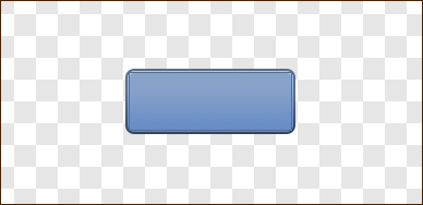
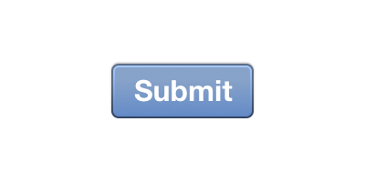
In this tutorial, you will learn how to make a custom ‘Submit’ button that can be found on a lot of websites these days.
|
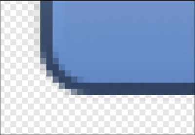
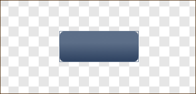
Break it down. If you zoom in on the image, you'll notice that the button is made up of 4 distinct components. There is an outside border (outer highlight), an inside border (inner highlight), and the meat of the button. Each of these first 3 parts contains a gradient. The gradient is not as distinct for the edges, but it's there. The final component is a drop shadow that shows up on the outside bottom of the button. |
|
|
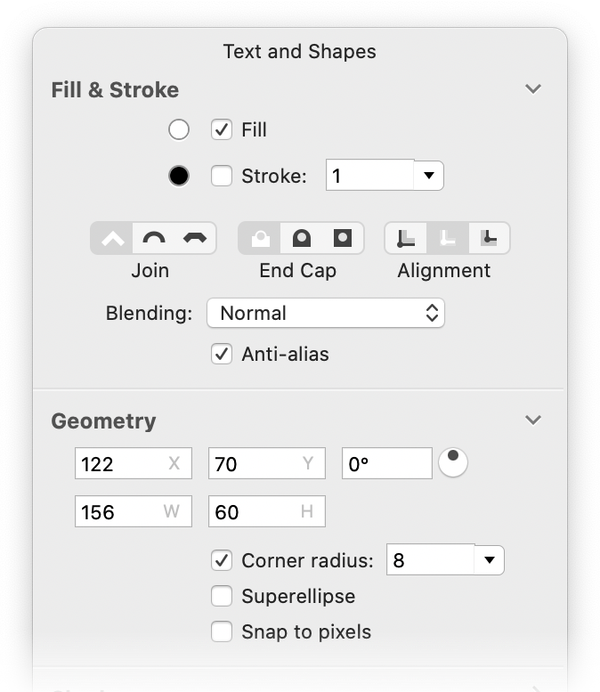
Start at the beginning. Create a new image in Acorn, File ▸ New. Enter 400 x 200 pixels as the dimensions with a ppi of 144 and set the background color to transparent. Next, click on the rectangle shape tool button in the palette. You can also use the shortcut key 'R' to select the rectangle tool. Make sure the fill button is checked, set the corner radius to “8”, and uncheck the stroke button. With the rectangle tool selected, make a single click on your canvas. A square will be created. Go to the inspector palette and enter 156 for the width, and 60 for the height. Using the move tool (shortcut key 'v'), drag your new shape to the middle of the canvas. If you have "Snap To Canvas” turned on, the shape should snap to the center of the canvas when you get close. |
v |
|
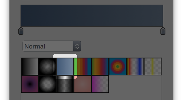
Select the gradient tool. Make sure your shape is selected, and then choose the gradient tool from the palette (shortcut key 'G'). Select the gradient highlighted on the right. |
|
|
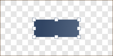
Put a gradient on the shape. If you had your shape selected, your canvas should look like the first example on the right. You'll notice that the gradient goes from left to right by default- but it needs to go from bottom to top. To do this, make sure the gradient tool is still selected. Using the mouse, drag a line from the bottom of the shape to the top of the shape while holding down the shift key. This will re-orient the direction of the gradient from bottom to top. Holding down the shift key places the gradient at a perfect 90 degree angle. Your canvas should now look like the second image to the right. This is a good time to save your image and give it a descriptive name like "Submit Button". Be sure to save it as a .acorn file. |
|
|
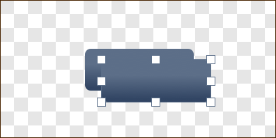
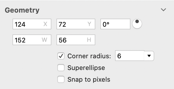
You made the border. But it's a box. It's a border box! It might not look like it just yet, but you've just created the outside border to your button. Select the shape using the move tool, and copy it. Go to Layer ▸ New Shape Layer and paste it. The duplicate shape will become the inner highlight of the button. Make sure the duplicate shape is still selected. Click on the rectangle shape tool in the tools palette again (or press the 'R' key). Change the size of the shape to 152 width and 56 height. Reduce the corner radius of the duplicate shape to 6 px. Next, using the move tool, drag the duplicate shape to the center of the canvas so it's right on top of the original shape.
|
|
|
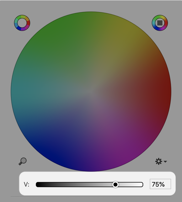
Time for a lighter inner gradient. Since the inner highlight is by definition lighter than the outside, you'll need to change the values of the gradient. If you double click on the first gradient move widget (that's the guy that looks like this on the gradient palette: Next, double click on the second gradient widget, and slide the brightness slider 100% to the right. The button should now look like this:
Hey- you're getting there! |
|
|
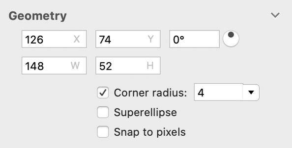
One more gradient to go. To make the third shape, follow the same steps as outlined for creating the second one. Start by selecting the smaller shape, copy, and then paste it on the canvas. Using the rectangle shape tool, set the width to 148, the height to 52, and change the corner radius to 4px. Drag the shape to the middle of the canvas, and make sure it stays selected in order to change its gradient. If you look back to the original image of the button, you'll notice that the big inner gradient is darker than the highlight, but lighter than the outside border. When adjusting the final gradient, keep that in mind. With the gradient tool selected, double click on the first gradient move widget to bring up the color palette. Drag the brightness slider a bit until it's about 70% to the right. Double click on the second gradient widget, and drag it until it is about 75% from the right. Deselect the shape. The canvas should now look like the image to the right. It's looking pretty good! |
|
|
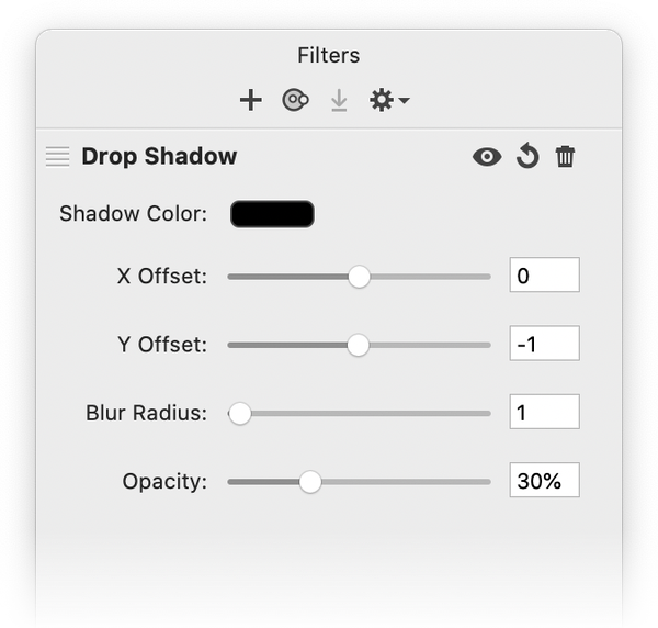
Making a drop shadow using a filter. There's one final thing missing from the 4 parts of the button, and that's the drop shadow. Click on your bottommost shape layer in the layers list. Bring up the filter window by choosing the Filter ▸ Stylize ▸ Drop Shadow … menu item. Change the X Offset to 0, and the Y Offset to −1. Change the Blur Radius to 1, and then finally set the Opacity to 30%. You officially have a very stylish button. |
|
|
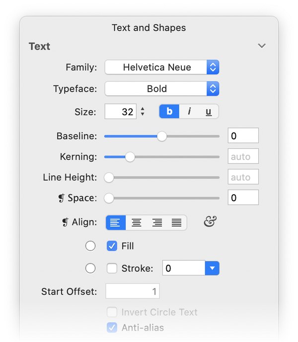
Text it up a bit. Choose the Layer ▸ New Shape Layer menu item. Why? Because in order to style your text up a little bit, you need the text to be on its very own layer for it to work right. Move this layer to the top of your layers list. Click on the text tool (shortcut key 'T') in the tools palette. Change the Family to "Helvetica Neue", change the Typeface to "Bold", and set the Size to around 32. Click on the canvas with your text tool (right over the button) and type the word "Submit". Press the ESC key to end editing, and using the move tool align your text so it fits over the button. Here's what it should look like:
|
|
|
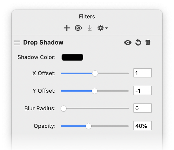
Filters, one more time. With the text layer selected, bring up the filters window again by choosing Filter ▸ Stylize ▸ Drop Shadow. Change the X Offset to 1, Y Offset to −1, Blur Radius to 0, and set the Opacity to 40%. |
|
BEHOLD! IT IS DONE! A BUTTON AT LAST!
Hopefully you've learned something valuable today- including how to make a neat button with Acorn.