Creating Pressed Text
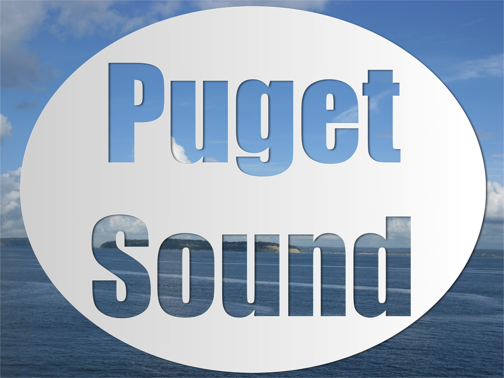
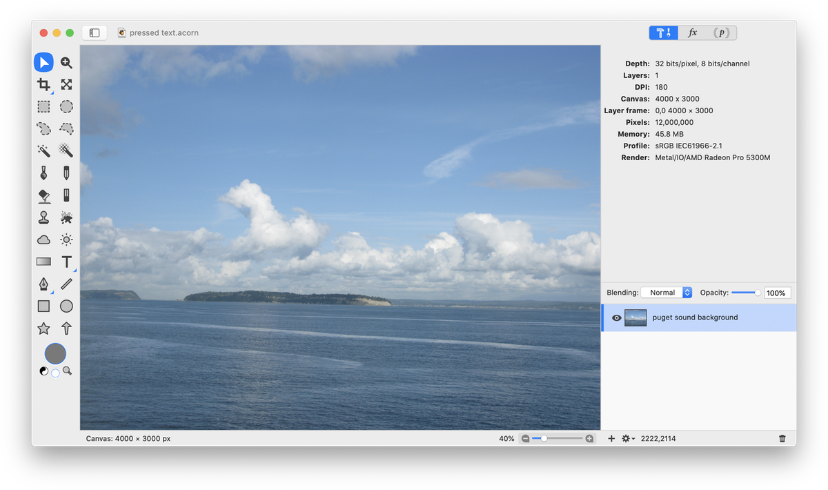
A pressed text appearance is a fun way to give text depth, and it is fairly easy to accomplish. Open the image you will use as the background in Acorn, File ▸ Open. This tutorial will use an image of Puget Sound.
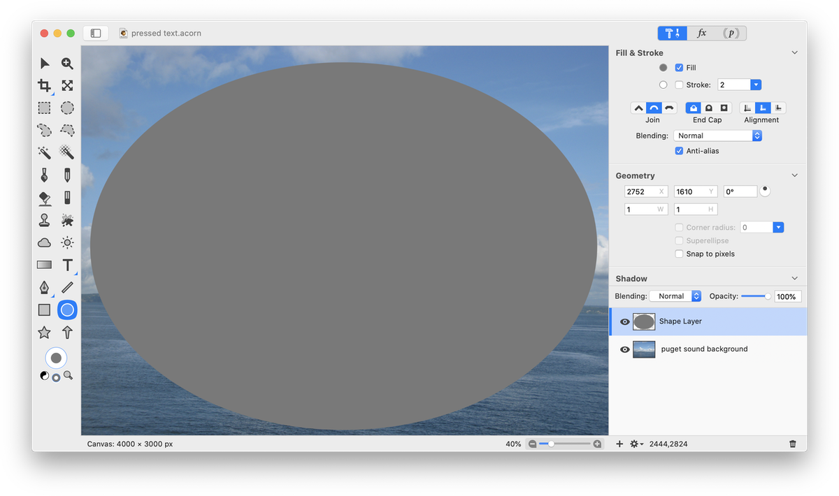
Next, create the shape your text will rest on. If you want a perfect circle, hold down the shift key as you create the circle shape. Make your shape with a fill, but no stroke.
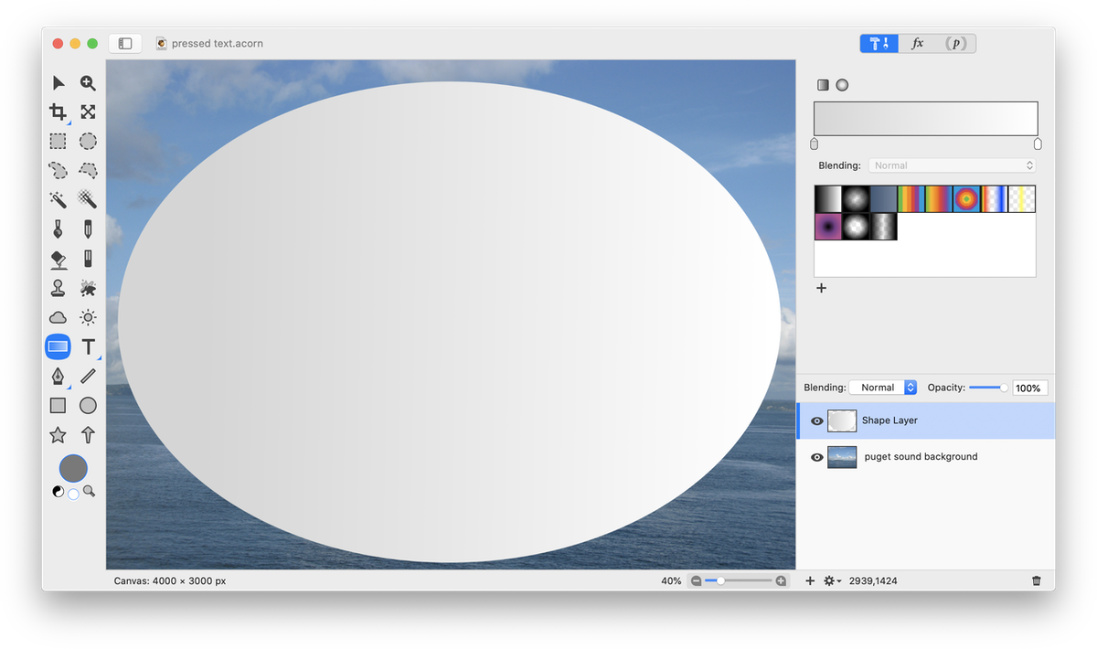
With your shape still selected, click on the gradient tool and draw a linear light grey to white gradient in the shape.
Rasterize the shape layer, Layer ▸ Rasterize Shape Layer. Using the text tool, write out some text. Get the font, size, and layout the way you want it. Usually bold thick fonts work best. Impact is the font used here.
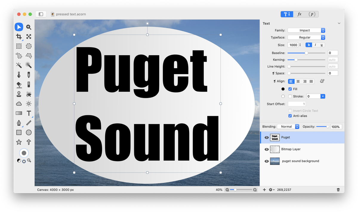
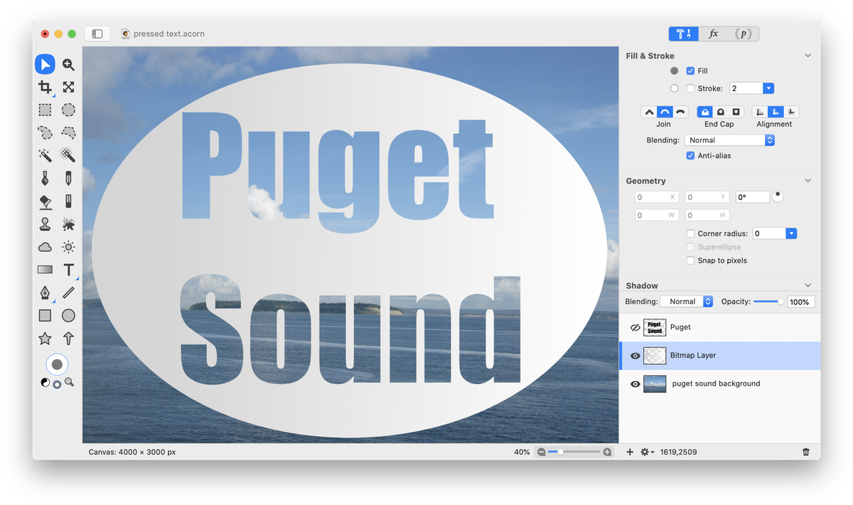
If you have multiple text layers, merge those layers down into one (Layer ▸ Merge Down). Once you have a single text layer, choose Select ▸ Make Selection from Layer. Hide the text layer by clicking on the visibility icon to the left of the layer in the layers list. Click on the layer with your shape. Click the "delete" key and deselect (⌘D). You should now be able to see your background layer through the text!
To give the punched out text some depth, apply a drop shadow. Select Filter ▸ Stylize ▸ Drop Shadow. Play around with the shadow color and x/y offsets to achieve your desired effect.
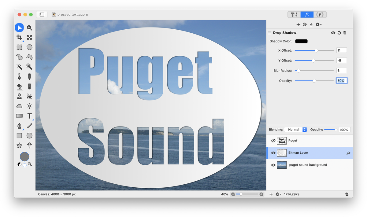
Move the punched out text layer around until you get it lining up with your background correctly. Use the crop tool if you need to trim down the edges of your image.
